
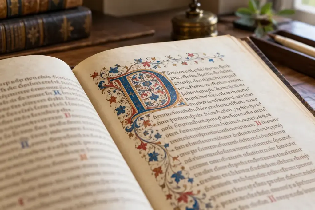
A large painted letter can be the first thing your eye finds on a manuscript page, even when you cannot read the language around it. Its beauty attracts attention, but its position may also help a reader locate the beginning of a text or an important division.
Getty’s exhibition on the decorated letter explains this practical role. Some initials carry foliage or other ornament; a historiated initial includes a scene or identifiable figures. Those terms describe features to examine, not a shortcut to dating every page.
Look from the whole page towards the letter
Begin with a full-page image in a library or museum catalogue. Notice the number of text columns, the margins and the scale of the initial beside ordinary writing. Then zoom in. A cropped decorative letter can hide the relationship that made it useful to the reader.
Try three questions in your notebook: What begins beside this letter? How much space does it occupy? Does the decoration remain inside the letter or extend into the margin? If you cannot read the text, mark that question unresolved and consult the catalogue description.
Getty’s guide to examining a manuscript page shows how initials belong among other features that organise reading. Study those relationships before deciding that every large letter is simply a chapter heading in the modern sense.
Keep description separate from identification
“A red initial with a small seated figure” is an observation. Naming the figure or assigning the page to a particular workshop requires additional evidence. Use the collection’s identification when available, and preserve any uncertainty in its wording.
Finally, return to the full page after studying the detail. The letter may now look less like an isolated miniature and more like a deliberate invitation into the text. That shift in attention is a rewarding part of reading a book as a designed object as well as a container of words.