
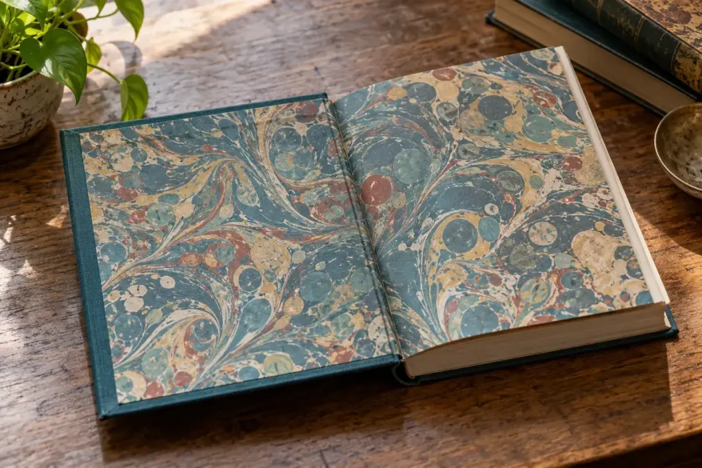
Open a hardcover just inside the front board and pause before the title page. The first sheet may carry marbling, a map, a solid colour or no decoration at all. It can be an endpaper: a part of the book that joins visual design with physical construction.
In many casebound books, one part is pasted to the inside board and another remains free to turn. Binding methods vary. The Library of Congress’s history of its binding work includes endpaper design as a structural consideration, showing why these sheets are more than spare pages.
A slow look at one book
Support the book comfortably and open it only as far as it moves without resistance. Identify the inside board, the pasted sheet and the first free leaf. Notice whether the paper differs in weight or colour from the text pages. There is no need to tug at the hinge to understand the arrangement.
Now consider the design. Does the front pattern continue at the back? Does a map prepare you for the story’s setting? Does a plain colour pick up a tone from the cover? These are observations you can make without assuming the designer’s intention.
A useful reading-journal entry can include the edition, publisher and a short description of the endpapers. That makes comparisons between editions more precise than saying one copy feels nicer. Avoid photographing private inscriptions or ownership details for public sharing without permission.
If the endpaper is split or lifting, resist using ordinary tape or glue as an immediate repair. For a valued or fragile volume, ask a qualified book conservator or suitable repair service about the whole binding. The visible tear may be part of a larger structural problem.
Next time a book feels especially satisfying to open, look at these quiet pages. Their colour, texture and movement may be doing more work than you first noticed.